The Dons are due.
It started with an idea. What about some new jersey apparel? What could they look like with a fresh take? Could we capture that feeling of wearing history on every jersey? I contacted Seth Reese to commission designs of the USF Dons jerseys. What Seth came back with was two-fold.

1950s Redux
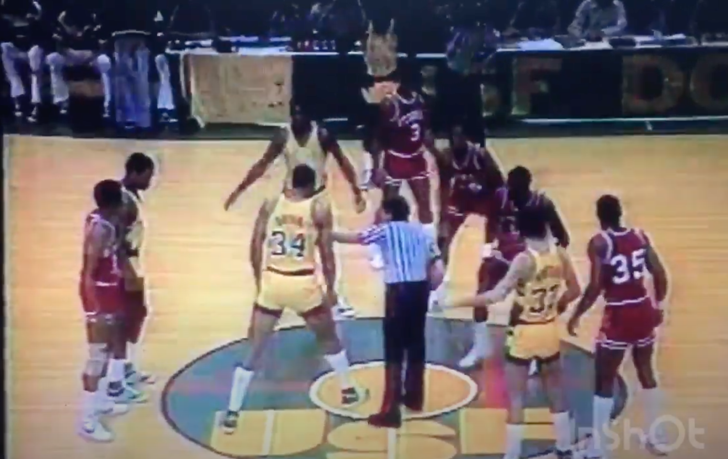
A retro-inspired design with bold lettering. Right on the heels of USF's recently won national championships. Inspiration for the side paneling was taken from footage of Georgia @ USF in 1981.

Timeless Script
A script logomark that would follow the program for years to come. Coupled with a minimalist design, you have a modernized jersey that looks rather exciting to wear. The front and center "Dons" advertizes a team that needs no other explanation. "We are Dons."

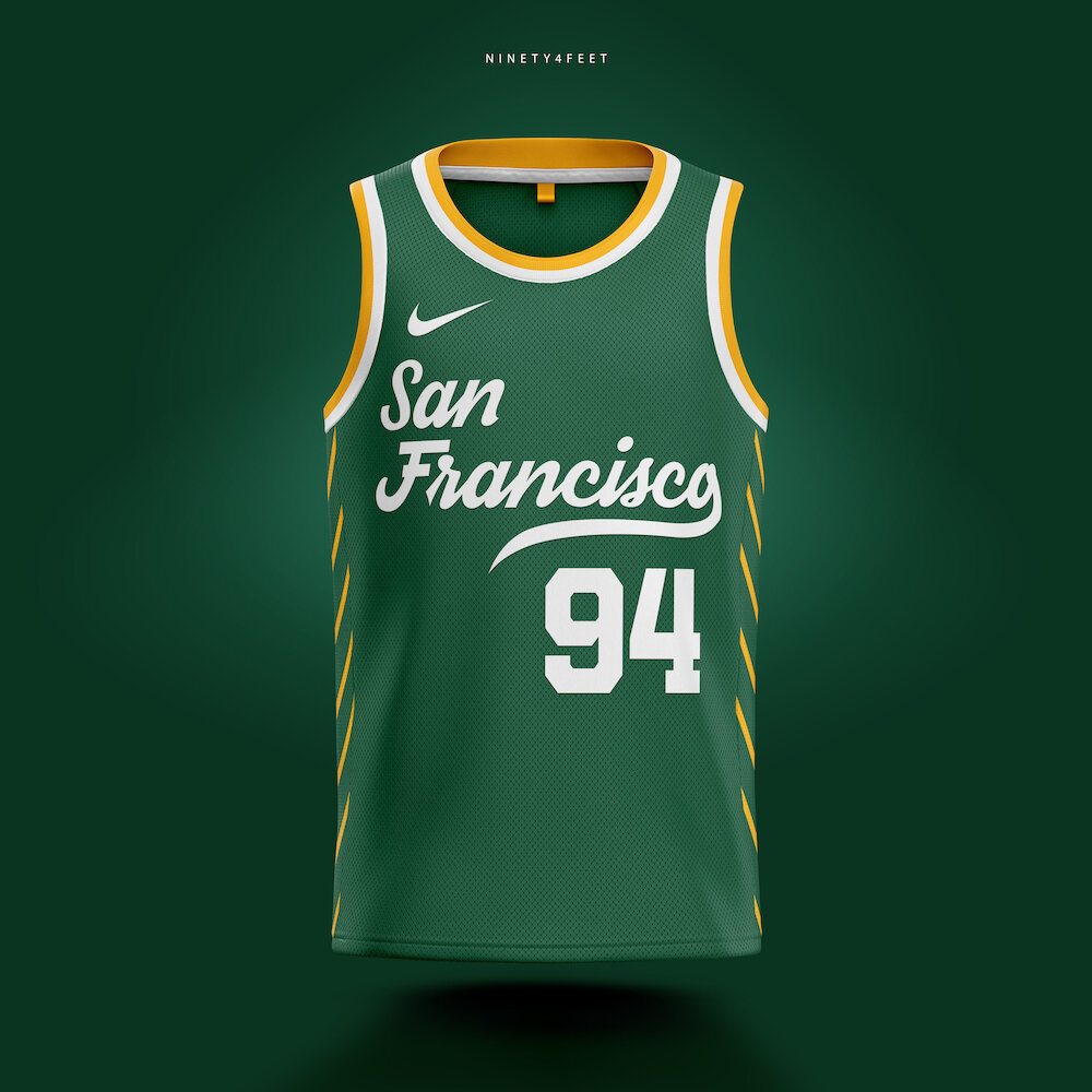
A bit of the city in every jersey.
Inspired by the cities architecture. The side paneling piping represents the suspension cables from the Golden Gate bridge. A way to bring an iconic landmark to the jersey.

Don’t call it a throwback!
It can go on shorts, a snapback hat, or on your favorite letterman. This ultra old school logo-mark is a retro way to show pride for the school from an era of black & white photos.